 Today was a beautiful snowy day. I was able to spend a few hours painting this morning before going out for some cross-country skiing with my husband.
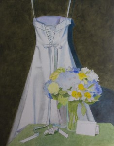
For the underpainting of this piece, I’m trying to keep the colors bright. It’s a technique I learned from Tom Buechner. The only real difference, I think, is that he often worked on Multimedia Art Board. That surface is very absorbent, and the underpainting not only adds color, it also seals the surface. I am working on canvas this time, which doesn’t need additional sealing. But I really like the way the transparent color looks – a lot like a watercolor.
If you look closely, you can see that shadows on the right side of the painting are very blue, while the shadows on the left side are more gray. That is because I’m working with two different light sources – natural light on the right, which is cool, and incandescent light on the left, which is warm. I like how the different colors of the two lights add variation.
I heightened the colors a little bit, and I’ll probably tone them down with subsequent layers of paint. Oil paint is generally transparent, so some of the underpainting will show through, giving the painting more vibrancy. I will likely lighten up the background a lot. Painting a light color over a dark color gives a cooling effect, and really makes the background sit back.
 Follow